In this episode of You’re A Better Artist Than You Think:
How color lies to our eyes (and why that matters to artists) with author Fritz Horstman of The Josef & Anni Albers Foundation.
PLUS: Changing our relationship to color from “painful” to “playful!”
How To Listen:
Listen to the interview via the YouTube player, subscribe to the audio podcast (Apple Podcasts, Spotify, Audible, Email) or read on for the transcript.
[UP NEXT: Jim Henson’s creative process!]
…Or Read The Transcript:
Chris: Let’s start, Fritz, with “Who is Josef Albers?”
Fritz: He was an artist, first and foremost, and a teacher, born in Germany in the late 19th century.
Uh, went to the Bauhaus where he first was a student and later ran the preliminary course there, and then came to this country with the closure of the Bauhaus under pressure from the Nazis.
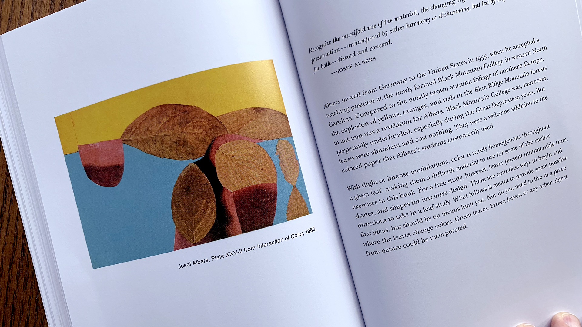
…and then taught at Black Mountain College, which was this progressive liberal arts college in North Carolina. He was there from 1933 until ’49.
In 1950, he was made chair of The School Of Art At Yale and lived the rest of his life in Connecticut.
Through all that time, he was making art. When he arrived in this country in 1933, he suddenly begins painting. He hadn’t really painted before and color is immediately the thing he’s focused on.
Interaction Of Color
Fritz: Also, when he arrived at Black Mountain in ’33, he started teaching color (specifically, a color course) and that color course eventually developed in 1963 (so three decades later) into a book called Interaction Of Color, which is very widely known.

It’s one of the most important books on color in the canon right now.
…has been for sixty-one years at this point.
So many artists own it, so many students own it. It is canonical, it’s beautiful.
…and what it is, it’s sort of a crystallization of how he thought about color and how one can experience color.
…and your question of, “What do artists do with it?” It is very much about the user’s experience, not about memorizing some rules about color. Whatever complementary colors are, or the color wheel, or other color systems.
He, of course, was very aware of those systems.
…but what he begins his book with, and what he begins his color courses with, is sort of trying to put that all to the side, and say, “Let’s just experience color and then we’ll have our own understanding of it, instead of memorizing someone else’s rules.”
Science Vs Experience
Fritz: So there’s this much longer history, which maybe we can get into if you want to, about sort of where Newton and Goethe sit within this, and that might be getting deep real quick.
[LAUGHTER]
Chris: Sure, yeah.
I guess we could say there was a state of the art at the time (in terms of the research on color theory) that continued to develop and become more accurate as computers got involved and even as we were able to measure light in more sophisticated ways.
Would it be accurate to call it an “emerging” science at that time or was it too developed, do you think?
I don’t know how to think about that.
Fritz: It’s fair to say it was an emerging science, and then there were all these new tools and ways of thinking about it, and those continue to develop, I think.
…but, in many ways, none of that really matters for Albers.
He also pushed back against the idea of a “theory.”
Color theory was antithetical to him.
(Can you have an antithetical theory? That’s an interesting thing.)
[LAUGHTER]
Chris: That’s hilarious.
Sure. Sure, sure we can.
Fritz: So he put himself in line with the 18th century German polymath, Johann Wolfgang von Goethe, who himself wrote a book on color theory.
…and within that book says something to the effect of, ‘There is no theory of color. Look only to the blue of the sky. That is the theory of color.’
So Goethe was a poet, and he was very interested in this poetic understanding of color and Albers puts himself in line with that and says, “Our experience of color is what matters.”
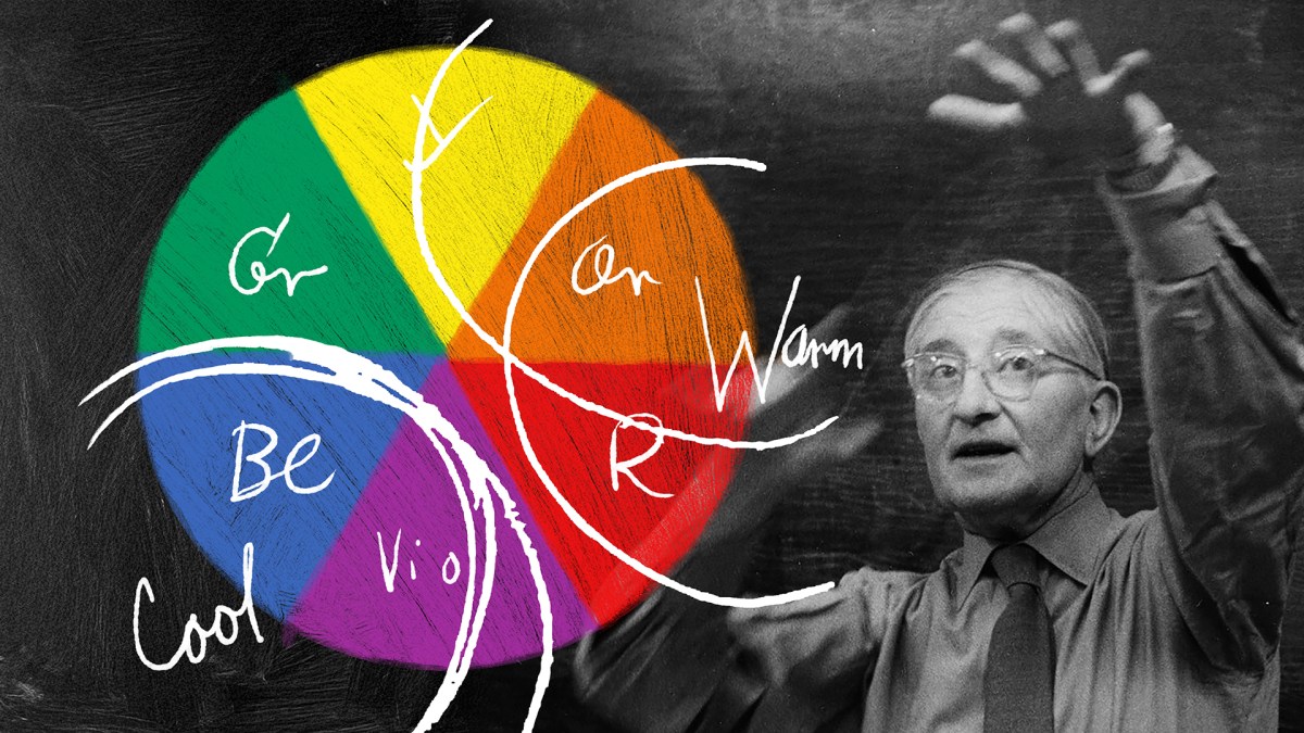
Color Relativity
Fritz: …and the exercises that he sets up in his classroom and then in Interaction Of Color, are just about experiencing color.
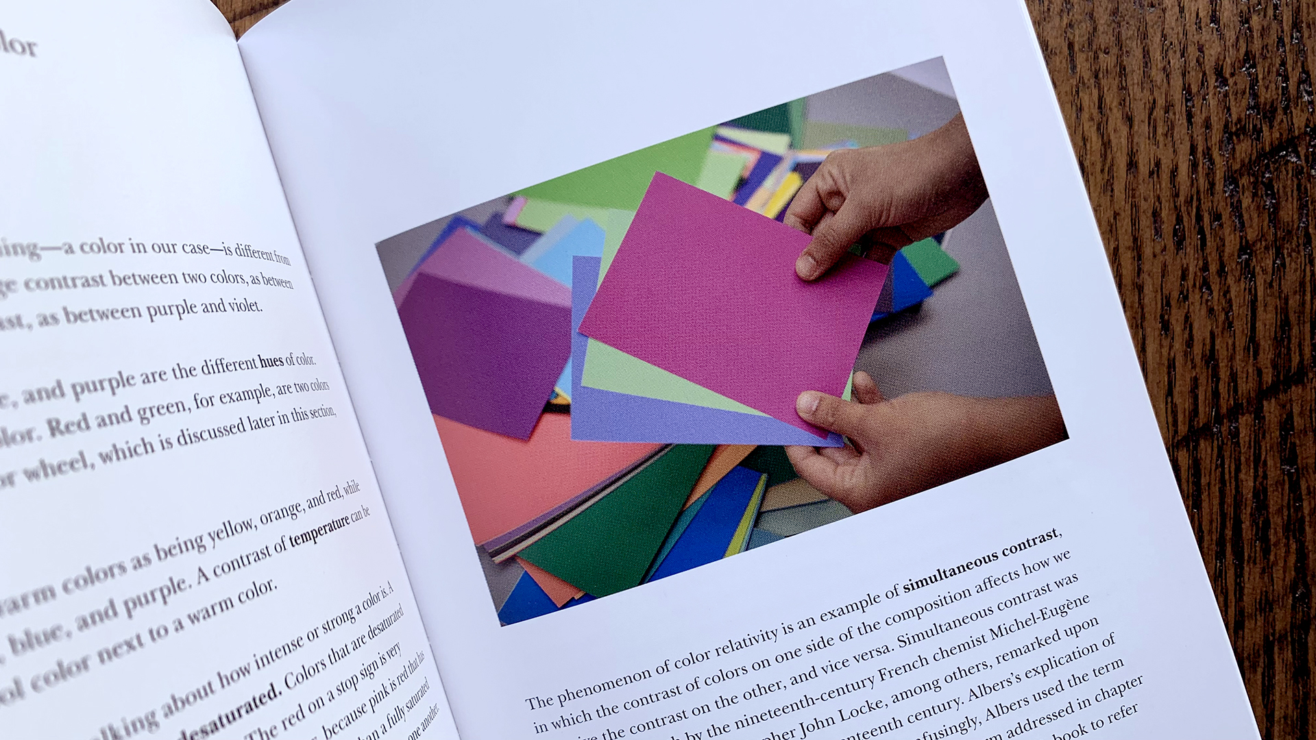
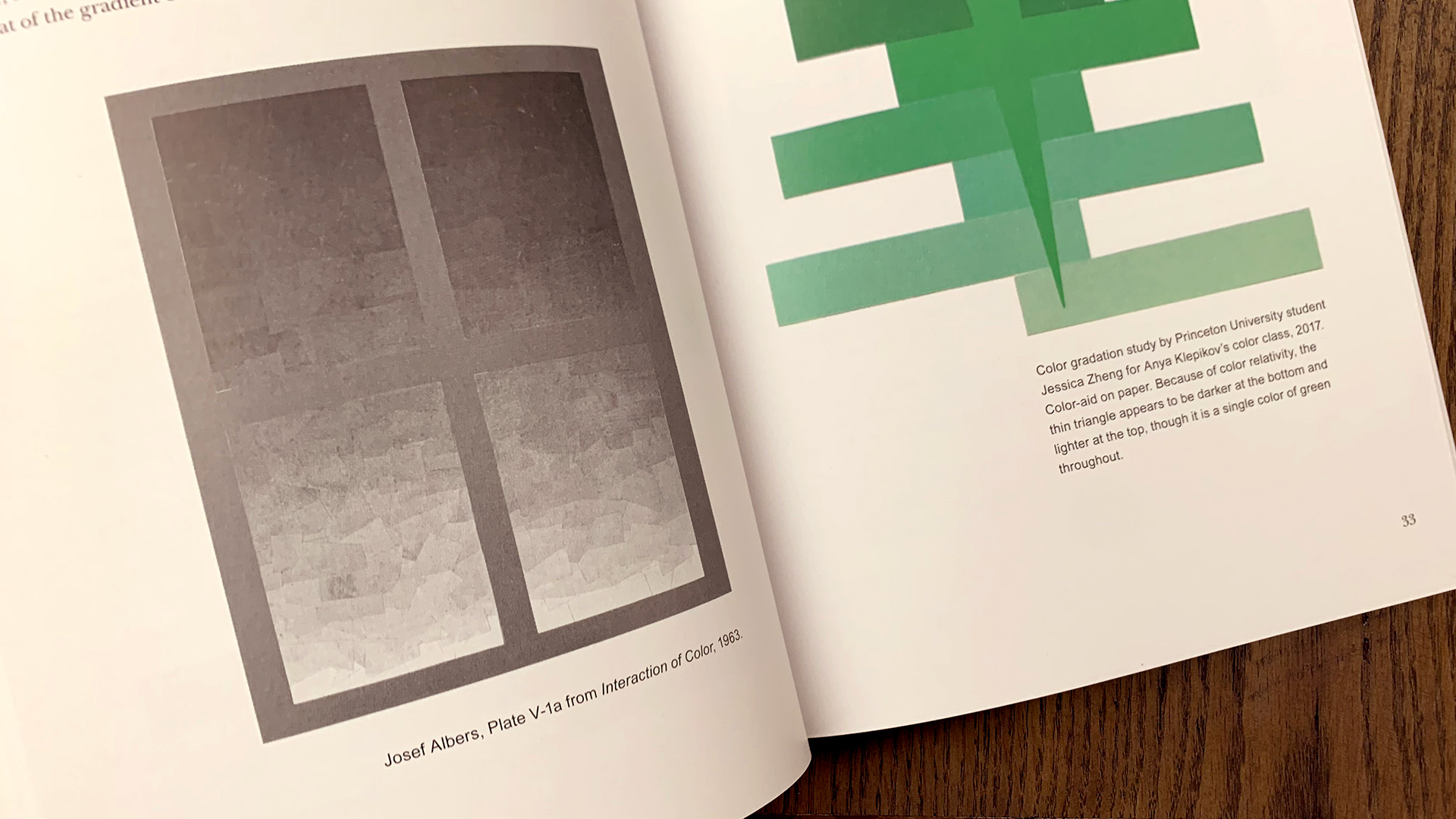
So the first thing that we start with in his book is color relativity.
Color relativity is the idea that one color can change its appearance when surrounded by different colors.
And so just an easy thought experiment (because I realize we’re just audio here) is if you just picture a single color green (whatever, grass green) and surround that grass green with yellow in one case, and then surround it with blue in another case.
…and that green is going to appear differently against the yellow than it appears against the blue and that is because of color relativity.
…and there are so many nuances to that.
…and you and I are going to see that probably slightly differently, but you know, we’ll generally probably agree that the green on top of the yellow feels a little darker and the green on top of the blue feels a little lighter, but other nuances come into it.
This basic idea of color relativity is so nuanced, it can’t be some overarching theory that completely explains the whole thing away.
That kind of puts Albers’ approach to color in a nutshell.
Playing With Color
Chris: Something else that I think is not unique to Albers’ approach, but I think significant, is the playfulness of his approach.
…and his passion seems to have been so contagious to people.
…his students, his fellow faculty, but then also translates through his work in so many ways…
…this idea of joy of discovery.
…not just of seeing color relativity in the infinite different possible, combinations, but almost spirituality in a way.
What do you think about that?
Fritz: Yeah, I think all that’s true.
Playfulness is very much there.
He comes from this background of learning by doing.
Before he was at the Bauhaus, he was teaching grade school. So that’s, I think, important to remember. He was teaching down to ages five and six and up through high school.
You only learn through play at that age. There’s no rote memorization, maybe there is a little bit, but generally, the best way into education (particularly for young people, but for everyone) is through play.
We’re built that way.
…and so his exercises are very playful.
Homage To The Square
Fritz: He might have this perceived reputation as not being playful.
You know, he’s just hard edges on his paintings and everything’s very clinical and square. But, okay, yeah, they’re squares, but he played with those colors.
His most famous series of paintings is known as the Homage To The Square, and that comprises three or four squares of nested colors. Each square is a single color and so it’s really just a way to look at how one color sits next to another and next to another.

…and he painted them for twenty-six years.
He said they were “platters on which he could serve his madness for color.” He said they were “containers for color,” right?
So these are playful ways (slightly esoteric ways) of talking about them. But he’s given himself sort of a playground there to work within.
Chris: Yeah, amazing.
The Personification Of Color
Chris: You point out something in the beginning of your book where you’re talking about how he would personify colors and he would talk about how they would mix and he would describe these mixtures as gossip or jealousy or these kind of things.
…and that’s just so perfect.
That just seems like, probably, what it was like all the time, I would imagine, with him.
Fritz: Yeah.
Going back to that idea of the green that’s surrounded by yellow or by blue, if we think about those three colors, right? There’s yellow, green and blue in that group and, essentially, the green splits and becomes two different colors in our perception because of how it looks against the yellow and against the blue.
Albers never said this specifically, but he might have said that the green is “talking” to the yellow about yellow things, (maybe some gossip over there) and the green “talking” to the blue about blue things.
[LAUGHTER]
…and so they’re able to have these different conversations.
“Cousins” versus “siblings” or something…
But he had all these fun, different ways of talking about how colors could interact with one another.
Chris: Yeah. Amazing.
Last thing about his personal relationship to color.
Rothko And Albers
Chris: I don’t know if this is a common association or not, but I often think about Rothko and Albers.
Something that it seems like they have in common is kind of, “Shh… Don’t worry about it. Just feel it,” you know?
“Just sit there and pay attention and just be with the color and just feel it. It will show you things.”
Fritz: Yeah, I think that’s fair.
To be clear there’s no historical connection between these two artists. They never knew each other. There’s no doubt they knew of one another. They’re coming into their, let’s call it “mature” styles right around the same time. But they didn’t know one another.
…and I think you’re right that they’re wanting us to be with color, and be with the painting.
…and the way you’re talking about it, there’s this sort of romantic relationship.
Not sexy “romantic,” just like, you know…
Chris: Yeah. Romanticism.
Fritz: Right.
…and Albers sits so comfortably between romanticism and realism, whereas I think Rothko is much more heavily in the romanticism camp.
We are getting into some nerdy art historical territory here, but fair enough. Let’s go there for a second.
Um…
[LAUGHTER]
In Albers’ paintings and in the classroom, there is equal amounts of romanticism and realism.

In the paintings, he makes it very apparent how the painting is made. He’s painting on masonite, which is a composite wood building material. He makes it very clear how the painting is made. He frames them with kitchen counter edging.
(So those metal frames, if you’ve ever seen one of these things, that’s a version of kitchen counter edging that you might’ve seen in a house in 1960.)
So they’re very mundane. They’re just objects of the world.
He always left a white border at the edge of his paintings. And he said he wanted you to know where the painting ended. And I think that points to your idea of like, having this experience with the painting. He knew that there’s something that happens within the picture plane of the painting that is somehow different than what happens outside of the painting.
There’s some, magical thing or religious-like thing that happens there. We’re able to perceive a different variety of the world, a different version of the world within the painting than we see outside of it. And he left that white edge and framed it in such a way that we’re able to hold both of these ideas simultaneously.
Whereas Rothko I can’t speak nearly as much about (because I don’t know his work nearly as well as I know Albers’) but I think he wasn’t interested so much in the inside-outside. I think he really just wanted this overwhelming, like, you can be sucked into this painting…
Chris: Immersion.
Fritz: “Immersion,” exactly.
In the classroom, Albers was equally able to say, “Look, we’re learning the grammar of color here”. He frequently compared his art classroom to learning the grammar of writing and saying things like, “Look, you’re, you’re not going to write poetry until you learn how to write the language and, similarly, you’re not going to make poetic artworks until you understand the grammar of art.”
…and so Interaction Of Color, and in turn my book, Interacting With Color: A Practical Guide To Josef Albers’ Color Experiments, is in some sense a grammatical lesson in how to get us there.

But very quickly (and I emphasize this in my book) we sort of learn the direct grammar thing of how to make one color look like two and all the different ways that might happen, and then we go into these free studies.
…and in the free studies, we immediately start to see these poetic things start to come out. I’m not pretending that the free studies that happen in my classrooms are like finished artworks that are on par with the masterpieces of history, but they could lead towards things like that.
Chris: So good.
Well, that’s a perfect transition point there.
Interacting With Color
Chris: Can you share with us about how you got involved with the Albers Foundation and what led to the creation of this book?
In so many ways, it’s a document of your work, at least over the past few years with the Albers Foundation.
Why this book and why now?

Fritz: So, your question of how I came to the Albers Foundation…
I’ve been here for twenty years, amazingly.
I was initially hired as the art handler and facilities manager and pretty quickly started doing educational things, just sort of because it’s my natural predilection.
…and, eleven years ago, I was made Education Director, and, in earnest, started running workshops.
…sort of figuring out how to connect the Albers (both Josef and Anni Albers’ classroom activities and their artworks) into museum settings, into classroom settings.
…and why is this still important, and in what ways can we make it relevant?
Josef Albers’ color course is certainly the most sought after of those topics that I cover.
I’ve run this color workshop hundreds of times and for years, teachers, artists, various people have been writing to me and saying, “Is there a teacher’s guide? Is there some way to get into Interaction Of Color?”

Because as beautiful and as canonical as that book is, it is a bit opaque. It’s written in this vaguely poetic way, which is, again, often beautiful, but it can be mysterious.
…and color is notoriously difficult to write about.
…and, where publishing was in 1963 when Albers made his book, it was much more difficult to have images and text alongside one another.
They have, in some ways, bridged that gap with more recent editions of Interaction Of Color and paperback editions, but it still remains a fairly difficult book to just work your way through on your own.
I had the great privilege ten, fifteen years ago of meeting a man named Fred Horowitz, who had been a student of Albers at Yale in the 1950s, and Horowitz took me through (we spent about six hours together) going through some of the core exercises of Interaction Of Color.
I had tried Interaction Of Color before that on my own and had not had great success. After working with Fred on that, I suddenly could see straight through the whole thing. Not that there aren’t still some mysteries in it for me, but it was much more accessible.
…and so when these teachers would write to me and say, “Is there a companion?”
I’d say, “Yeah, there’s Fred. Just go get Fred.”
But, sadly, Fred has passed away since then and so my book is essentially trying to recreate my experience of having someone take me through Interaction Of Color, for the readers.
Because technology in printing has changed so much in the last sixty years, I’m able to include a lot more images right alongside the text and I have a lot more “how to.”
Like, “Here’s what I did to begin with. Here are the supplies you need. Here are some examples of what you might see. Here are ways that you might talk about it. If you’re working in a classroom setting, here are some things that I’ve done with my classrooms.”
…not that you need to follow an exact script. There is no exact script. But, you know, a few basic ideas of how you can get yourself and maybe your students into this wonderful topic.
Chris: Yeah, it’s so good.
The way we met was I came down for one of your workshops in Bottrop, Germany.
Because I teach my own color theory class, I’ve read Interaction Of Color four or five times. I am just an Albers geek. I have a lot of the books and um, I’m just very familiar with the subject matter and then coming down and doing that workshop in person (to your point) was eye opening, as, uh, Albers would have wanted.
…and that’s kind of the whole point.
It all came out of his pedagogy, which was so interactive in and of itself.
Really, from now on, I’m gonna tell my students…
Because Interaction Of Color is, uh, required reading for my color theory class, I’m just going to put both books together now…
Fritz: Perfect!
Chris: …because it really is the best way to bridge the gap between the two.
Fritz: That’s great.
Let Color Come To You
Chris: We so quickly abandon things that seem that they’re too hard.
Fritz: Mhhm.
Chris: …and especially when it comes to color.
Conversations that I have with (even artists sometimes) but certainly people who want to be creative or want to explore color in some way, so often it’s…
They just go, “Oh, I just can’t see it. I don’t get it. Oh, you all see things totally differently.”
…and I’m not saying everybody’s eyes are made the exact same way, or everybody’s connection between their eyes and their brain is the exact same.
Of course not.
…but lots of people can.
…and I think, lots of people, they disqualify themselves prematurely.
Slow down and just sit with it.
Let it come to you.
Fritz: Right.
Chris: …and I think that’s the same way with, not just color, but other things too, but we’re specifically focused on color here.
You gotta stay with it.
…and something that I love about your book specifically is that…
The next logical question would be, “Yeah, but how? I mean, do I just stare at a few colored pieces of paper? Do I go to museums? What do I do?”
…and, and your book is: “This is what you can do.”
Fritz: Yeah. Absolutely.
How To Play With Color
Chris: There are so many different exercises in the book, I think it’s safe to say that we’re not risking giving away the farm by having you share an example of how to play with color.
Maybe something you think the majority of the audience would be able to have fun doing but also gain some insight from.
Insight about color…
Fritz: Making color gradients.

I love gradients. I love them in every form.
…just going from one extreme to another.
I love them in words. I love them in color. I love them in textures.
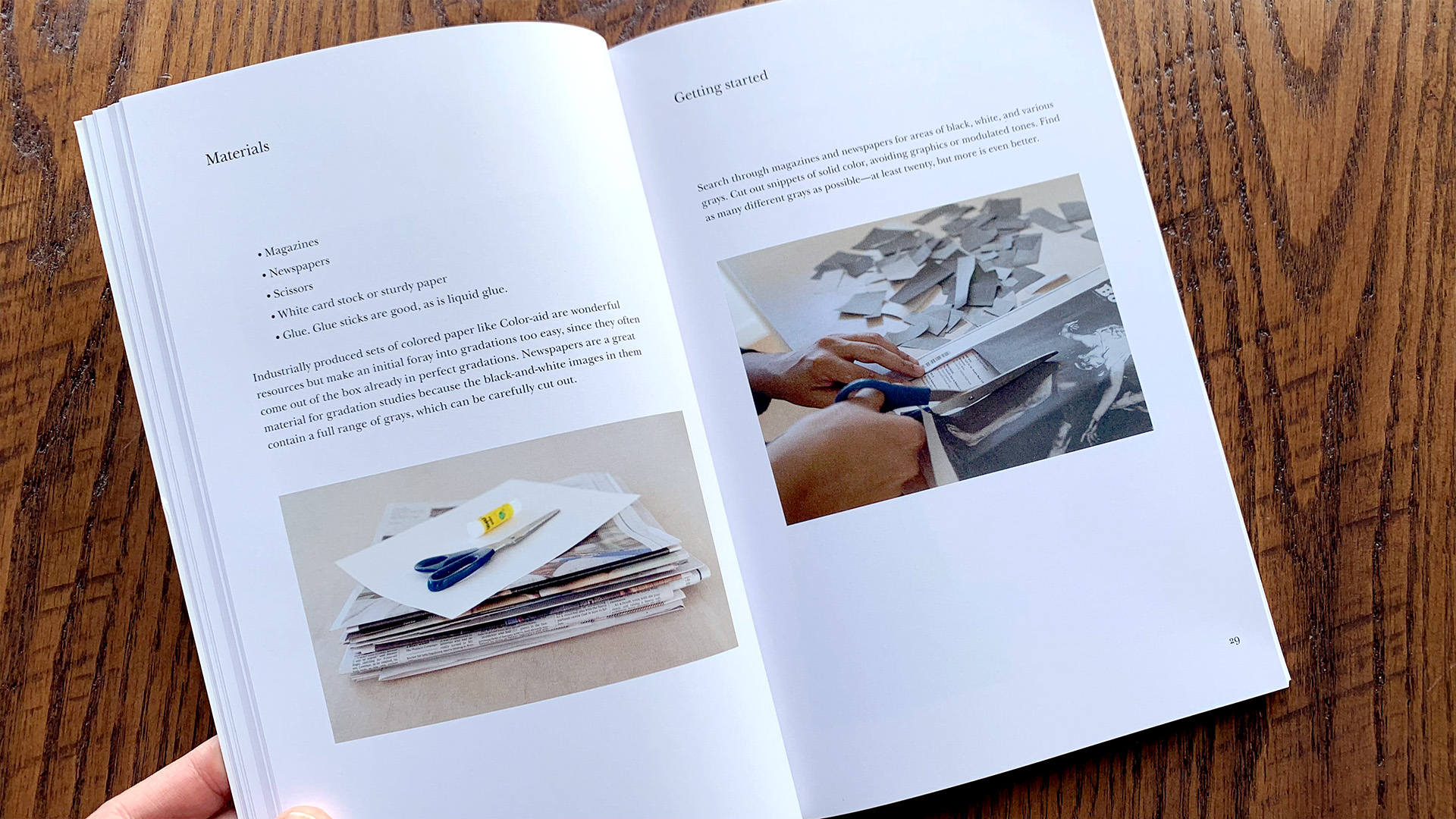
…and so, make a grayscale gradation.
So getting lots of different grays together from whatever the source. A newspaper is a great source, or anything you can cut up, and arranging them from the lightest to the darkest and trying to make a perfectly smooth gradation.
I think that’s a wonderful way to spend a rainy afternoon.
…or anytime.
You’re not just filling the time there.
You’re developing a nuance of the eye. You’re able to tune in and really see, “Well, this one is darker, this one’s lighter.”
…and in grayscale, we’re just talking about grays and blacks and whites, it’s very easy. There’s very little debate, whether one’s darker or one’s lighter.
Sometimes they’re so close, you think they’re actually the same, but generally one’s lighter, one’s darker.
Going then into hue. If you add a hue to that, let’s say you’re trying to go from yellow to purple, the extremes are going to be obvious. Like, “This one’s yellow, this one’s purple.”
…but the space in between that, the middle mixture, of what is halfway between yellow and purple, it’s going to be a very muddy color.
But that’s very satisfying. Very fun for me, and, I think, for a lot of people.
Trying to do that from cutout magazines can be quite hard. You have to find an awful lot of yellow-purples.
Chris: Yeah!
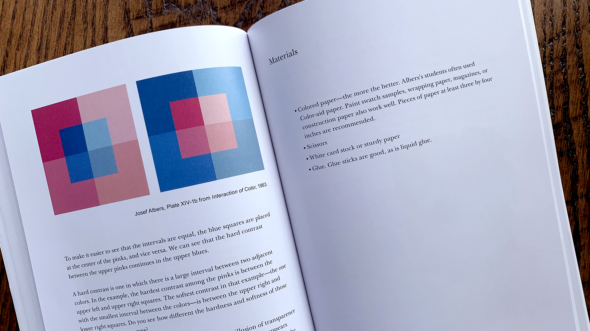
Fritz: But if you have access to Color-aid or, um, Color-aid being slightly expensive, you can simply go to the paint store (to the, the wall paint store) and just take every single color swatch.
…and I’ve done that a bunch of times. No one’s ever batted an eye.
Chris: Yeah.
Fritz: …and then you’ve got, possibly, a thousand different colors to play with.
…and then just making these color gradations.
Color Intervals
Fritz: So from there, you’ve developed this ability to see both extremes and the intervals between them.
…and this idea of color intervals is central to Albers’ approach to color teaching and to his own artwork.
People say, “Well, this is a big interval between this yellow and this green. That’s a big interval. But that green is actually pretty similar to the blue and so that’s a very small interval.”
Alright. So, we’ve got this idea of intervals.
How close one color is to another…
The Illusion Of Transparency
Fritz: Once you’re able to control or perceive those intervals, then you can start to approach the illusion of transparency.
…and, this is hard to describe just in audio, but I will attempt, again, with the green, the yellow, and the blue.
Let’s imagine you have a yellow gel, and a blue gel, and you overlap them, and they’re going to make a green. That’s something we all pretty much know.
If you were trying to make the illusion of that transparency using colored paper or using paint, let’s say, or some other material, you would need to begin with the yellow and the blue and then find that green that makes the illusion of the transparence believable.
And that is one of the first places where this becomes truly applicable.
People often ask me, “Well, what am I going to do with this understanding of color relativity?” and there’s not a straightforward answer. You’re…
But the illusion of transparence becomes a far more readily usable idea.
Color And Music
Chris: Getting back to the primary concept of color relativity.
You see a lot of, for example, videos on YouTube that talk about color and they will point this idea out, right?
“Here’s a muddy orange color, kind of a brownish orange color. You surround it with blue. It looks like one color. You surround it with yellow. It looks like a different color. Oh, tadaa, it’s actually the same color.”

The conclusion being that “color is a liar,” right?
It’s lying to you.
…but then, so often, that’s where it ends.
So then as an artist, you go, “Well, okay, what do I do with that? It just makes me more anxious about the fact that I can’t trust my eyes,” or whatever, when that was never the conclusion for Albers and it’s not the conclusion that you have drawn in your book.
Fritz: Right.
Chris: Why does that help me as a painter?
Fritz: Being able to talk about it, being able to spot it, being able to understand, “Well, this is where that interval is, and this is how that interval is,” makes you a far more powerful painter.
Albers uses the example of music. He says, “If a musician cannot tell the difference between a note which is higher and a note which is lower, they should probably not be making music.”
Fair enough, right?
[LAUGHTER]
A musician probably should be able to spot that interval and say it’s higher or lower.
…and a colorist, a painter should probably be able to say, “Well, this color is brighter or darker or more red or more blue or whatever.”
Chris: Yeah.
Fritz: …and, of course, we get into these areas where it’s very hard to tell and that’s often where the really interesting color stuff happens is when we’re really in the fine areas of it.
…but being able to see and talk about what those fine areas are, you can’t do until you’ve figured out the grammar of it.
Chris: Yeah.
Yeah, that’s great.
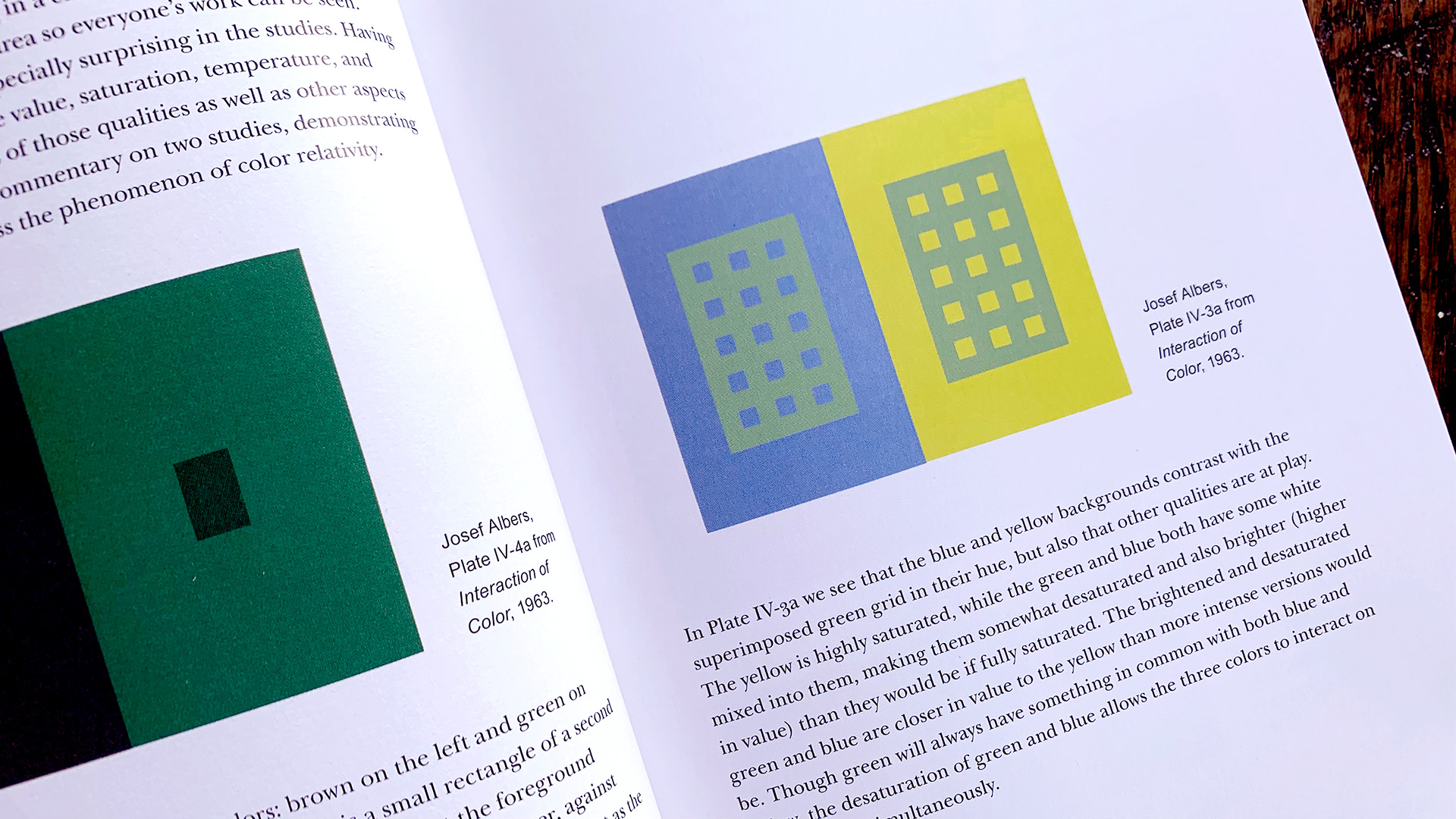
How Color Distorts Proportion:
Chris: Color also can affect our perception of proportion.
There’s a classic Albers assignment that you also show in your book where there are two pieces of colored paper blue and yellow next to each other and then a green grid.
The grid itself is knocked out so we can see the colored paper through the little square holes in the green grid.
Those holes appear to change size depending on what color they’re interacting with.
Where it’s green grid over the blue paper, they look smaller, and then the green grid over the yellow paper, they look bigger.
…and they’re the same size.
…and that, in and of itself, is important to know.
To know that even color can skew your understanding of how wide or tall or deep something is, is an important thing.
But I guess what I’m getting at though, is kind of a bigger point, which is this idea that once you’ve seen it in a more controlled experiment like this, you’re going to be way more likely to be able to catch those things when you’re out in the wild, making art.
You might not know exactly what’s going on, but you know to be more careful in your measurement, whether you’re measuring proportion or you’re measuring these very nuanced differences in hue or saturation or something like that, right?
By going through the experiments, it makes your eyes better.
Fritz: Absolutely.
“It makes your eyes better.”
[LAUGHTER]
Right!
To Open Eyes
Fritz: You’re coming close to this famous quote from Albers.
His whole pedagogical program was “to open eyes.”
The story is he arrived at Black Mountain College in 1933, spoke almost no English, and one of his students came up to him and asked him in whatever way, “Mr. Albers, what are you going to teach us?”
…and he, in that way that a non-native speaker might come up with a very incisive comment, says, “I’m here to make open eyes.”
…and that went over extremely well, and it really cut to the point of it.
…and so he repeated that over and over, and that sort of became his mantra as a teacher.
…and that’s to say that he’s really, yes, “opening our eyes.” He’s expanding our visual experience.
…and that’s not to say that his students weren’t fully visual before that, but being able to articulate what it is that you’re seeing, allows you a deeper understanding of what it is that you’re actually looking at.
So when you’re looking at these two grids and one of them feels like it’s closer or further or larger or smaller, those are color interactions that are specific to the value and temperature of the colors that are being used in that particular case.
He talked about (and I try to explain this in my book) the difference between a “factual fact” and an “actual fact.”
And so the factual fact, in the case of this grid that we’re talking about, is that the two grids are the exact same size and the same color.
But the actual fact (which is to say our perceived understanding of it) is that one of them is bigger, and one of them is smaller, one of them is closer, and one of them is further away.
Chris: Right.
Fritz: And seeing that, understanding the discrepancy of that, and being able to hold both of those ideas in your mind at the same time, is a far more powerful stance on understanding color than just saying, “Ugh, there it is, it’s bigger, it’s smaller, I don’t understand why. I can’t. I don’t know.”
No, we do know why, and we understand our perception of it in these particular ways.
No “Favorite” Colors
Chris: You talk in your book about maybe being skeptical of your own taste. Don’t just go to your default favorite colors and work with those.
Try all the colors.
I love how the exercises in your book, Interacting With Color, they can’t ensure that someone divorces from their own taste, but it certainly can help because you’re not trying to make a pretty painting in that kind of subjective way.
Fritz: Right.
Chris: Can you speak to that a little bit there?
Fritz: Albers talked about his classroom as a laboratory and in that laboratory, you can try things.
You can experiment.
…and, most certainly, we’re not picking the colors of our living room and we’re not getting dressed in the morning and making sure our shoes match our shirt.
It is a space where you can try anything and that’s completely encouraged.
That said, almost every class I teach, in that initial “color relativity” moment where we let that run for twenty minutes, someone will have chosen the exact same three colors that they are wearing.
[LAUGHTER]
You know, we have a little laugh about that and then I say, “All right, let’s choose a color you’re not wearing today.”
Chris: Yeah.
[LAUGHTER]
That’s awesome.
It’s so important, right? It’s so important. We might even continue to choose colors that we consider our preference or taste but, at least we can do that intentionally.
At least we’re more aware of our biases in that way.
Fritz: Yeah.
Yeah, and simply saying, “Well, these colors look good together…”
No quicker way to draw my ire in the classroom than…
Chris: Uh huh.
Fritz: …saying something like, “Oh, they look good together.”
Well, tell me how.
Developing Your Tolerance For Ambiguity
Chris: Something I say to my students all the time is, “One of the most useful skills you can develop as an artist is a high tolerance for ambiguity.”
Fritz: That’s true.
…and that’s so true within the Albers material.
Within my book, there’s never a “right” answer, never a “wrong” answer.
You just have to live with that.
Chris: Yeah.
Your perception will become more and more accurate. You’ll feel more precise and more intentional in the way you make decisions artistically or creatively.
Color For Non-Artists
Chris: …or even as just as an appreciator.
That was something we discussed in the workshop. You had some students who didn’t necessarily think of themselves as painters or whatever, but they just had learned about Albers somehow, and they just wanted to “open eyes,” right?
They just wanted to increase their perception and appreciation.
Fritz: Yeah. I love it when art historians, when curators take my workshops or read my book because that’s a group that often doesn’t have a lot of hands-on experience.
Art history can be taught in lots of ways, but there’s certainly connoisseurship that’s usually within that.
…and the hands-on, like, “How was this color made? How is this color chosen?” is so much more accessible when you’ve done it yourself.
…than just looking at old paintings and theorizing like, “Well, it might’ve been this, it might’ve been that.”
Chris: Yeah.
The Magic Feather
Chris: Okay, last question.
Our artwork for this podcast is an elephant holding a feather. This is of course supposed to evoke the idea of Dumbo, a character who could fly but was led to believe that he needed the magic feather in order to fly.
…and, spoiler alert, the takeaway in the story is you can let go of the feather, you are always able to fly.
What has been, for you, a magic feather in your career, in your work, in your art?

Fritz: So I went to grad school, got my MFA from MICA and had a wonderful experience there.
But, in some ways, that training left me with this idea that every decision that I made in the studio needed to have an explanation.
This, like, hyper-realism, the far end of the spectrum from romanticism: “I did this because of this. I did this because of this, and it represents this.”
…and I remember finishing grad school and there was a big de Kooning show at MoMA that summer and I remember going and de Kooning is like…
There’s no explanation for what he is up to.
I had this very visceral, emotional response to that show. It was beautiful, particularly sort of the 60s into 70s era.
…and I could just feel that feather of realism being set aside.
…and, from there, knowing that I would be able to have both of these ideas working simultaneously. I can say out loud, “I like de Kooning,” and it’s okay.
…and I also like Hans Hacke, who is extremely rational in his, decision making.
…and I, in my own studio, can then do both of these things also.

Chris: Yeah, that’s great.
It’s in that fusion. It’s in the fusion of, “I’m intentionally trying to do certain things. I’m conscious of certain influences or things I’m trying to emulate or talk about,” or whatever it is, “and also, I don’t know.”
…and also, “this is what my arm does.”
[LAUGHTER]
You know?
[LAUGHTER]
Fritz: Yeah, and there’s a falseness to the dichotomy of subjective/objective or romantic/realist.
These are, perhaps, useful frames to think about it, but they’re, they’re just lenses that you can hold up to whatever it is that we’re talking about.
…but there’s other lenses. There’s other ways to talk about it and, again, it’s just the experience of it and being able to talk about it and think about it in coherent ways that make it accessible and wonderful.
…and the reason that we want to be involved.
Chris: Yeah, can’t not. I just can’t, you know, can’t not.
There’s this appeal , and in particular color that, we’re just drawn to it and we just have to get in there and play.
In Our Next Episode:
Author Karen Falk joins us to discuss Jim Henson’s creative process!
Every Successful Art Career Is A Collaboration:
Get clear, relevant feedback on your work and personalized career guidance in our mentorship: The Clockwork Heart.
Never Miss An Episode:
Subscribe to this podcast on any of the major platforms (Apple Podcasts, Spotify, Audible, YouTube) and join our email list for notifications about future episodes, courses, and mentorship opportunities.
It’s 100% free and we will always respect your privacy.
Credits:
I’m your host, Chris Oatley, and our production coordinator is Mari Gonzalez Curia. Our music is by The Bright Sigh (which is me) and this show is made possible by The Magic Box Academy.
